heycar · B2C · 2023
An 18% engagement lift from a three-field search
Across four markets, high-intent shoppers were abandoning the homepage search before they ever saw a listing. The fix was to ask for less: five inputs became three, engagement rose 18%, and the design is still live today.

At a glance
The problem
The homepage search asked for five inputs before showing a single car. High-intent visitors were dropping off at the exact element built to help them, in every market.
The move
I built the data case for cutting the entry point to three fields and moving refinement to the results page, then shipped it as a shared design system component across Germany, the UK, France, and the Netherlands.
The proof
Homepage and search box engagement rose 18% after launch and abandonment at the search step dropped, in all four markets. The design has outlasted three years of product cycles.
The moment something felt off
Buying a car isn't a casual decision. By the time someone lands on heycar, they usually already know what they want: a make, a model, a part of the country where they plan to buy.
So the homepage analytics didn't add up. We were getting traffic from people with clear intent, and they were leaving without doing anything. The search box, the very thing designed to help them, was where they stalled. That hesitation became the thread I pulled on.
The wall disguised as a search bar
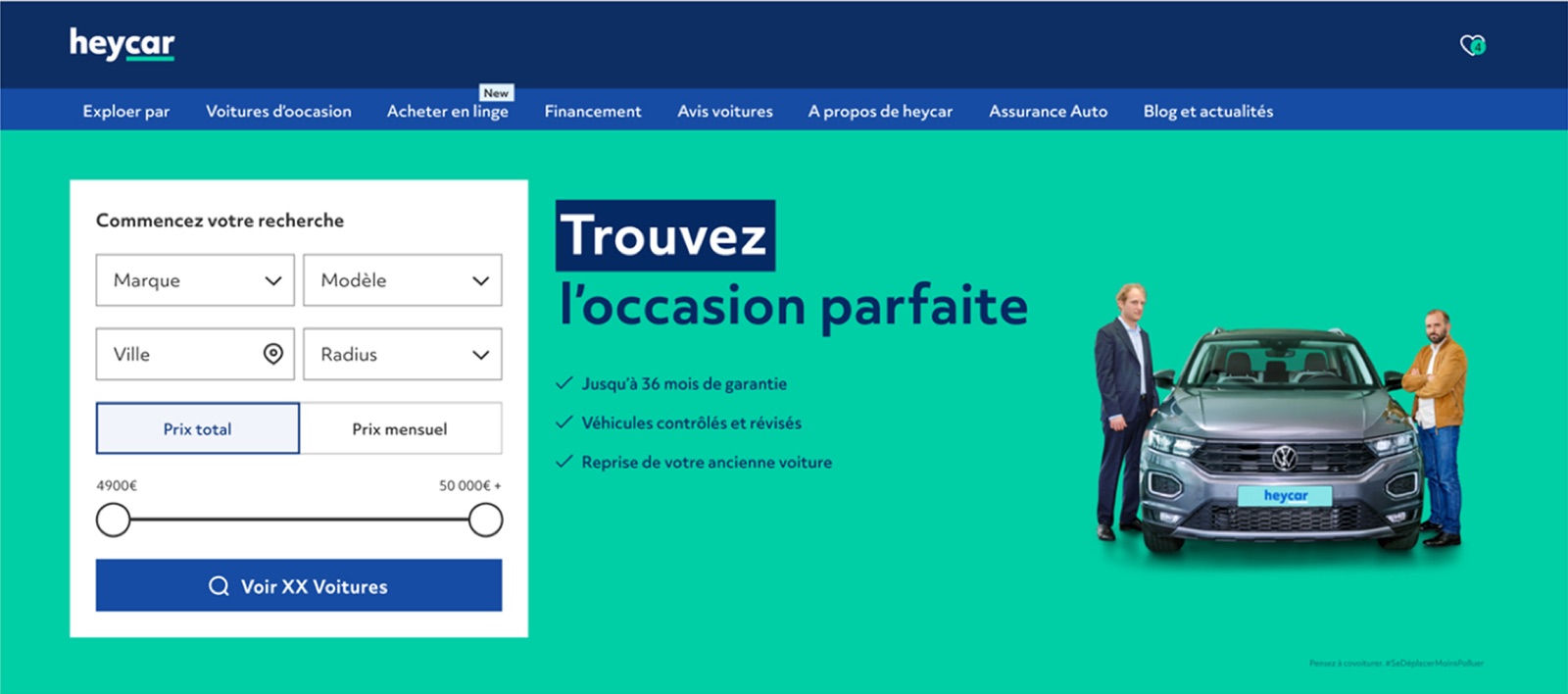
The homepage search asked for five things up front: make, model, city, radius, and a toggle for total versus monthly price.
The thinking was reasonable on paper. If users refined their search before hitting submit, they'd land on more relevant results. In practice, it was a wall. Five decisions before seeing a single car. Five chances to second-guess and click away. The funnel numbers confirmed it, and the pattern held across all four markets.
The bet I made early: the homepage was the wrong place for refinement. Power belongs in the platform, but power at the entry point feels like work.
Designing for four markets at once
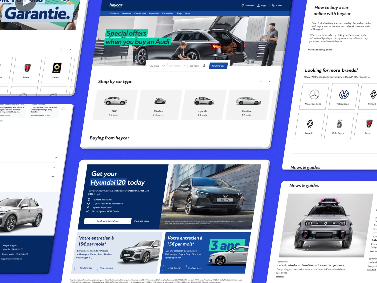
This wasn't just a homepage redesign. It had to work for Germany, the UK, France, and the Netherlands at the same time.
That changed how every decision got made. A component couldn't carry assumptions about postal code formats, vehicle data structures, or local buying behavior. The constraint sharpened the work: if a field couldn't justify itself in all four markets, it probably couldn't justify itself in one.
Convincing the room before convincing the user
The first hard conversation wasn't with users. It was internal. The team's instinct was that more filters meant a more confident shopper, and removing them felt like removing value. And because every change now touched four markets, every decision carried more weight.
I knew design alone wouldn't win the argument. The case had to come from the data, so I partnered with the PM on user interviews and funnel analytics across markets. Two findings reframed the room:
Most filters were being ignored. Radius and the price toggle saw low engagement on the homepage. Users skipped them, or set them and then immediately changed them on the results page anyway. This held in every market.
Three inputs carried almost all the intent. Make, model, and location. Everything else was refinement, and refinement only makes sense once you have something to refine.
That gave me the line I needed in stakeholder reviews: we weren't removing filters, we were moving them to where users were already using them.
How the redesign came together
I started by rewriting the brief. Instead of "redesign the search bar," it became "reduce the cost of starting a search." That single reframe made search initiation rate the metric the team rallied around, and made it much harder for new inputs to sneak back in during reviews.
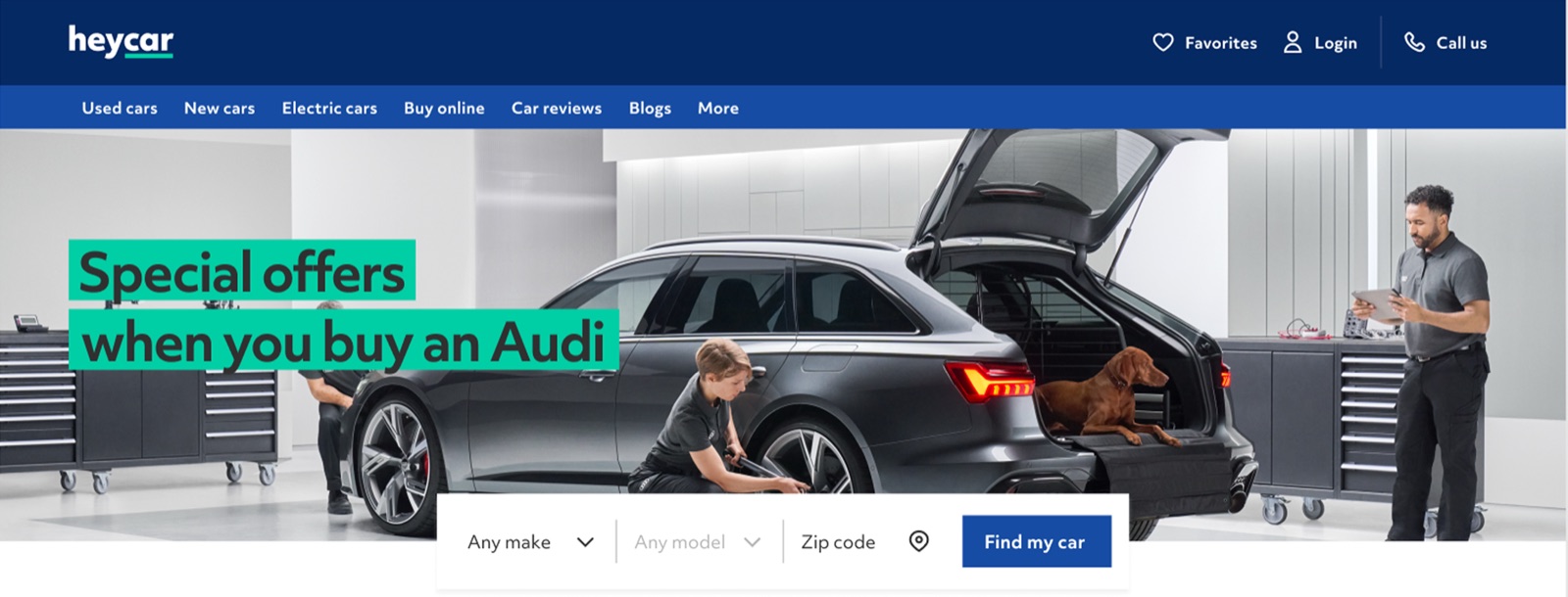
Visual hierarchy mattered as much as field count. The search CTA had been competing with everything else on the page. In the new design, it became the unambiguous next step.
The final move unlocked alignment: radius, price model, and the full advanced filter set were repositioned to the results page, where users already had context to use them. Nothing was lost. Things were sequenced.
Built for every market, not just one
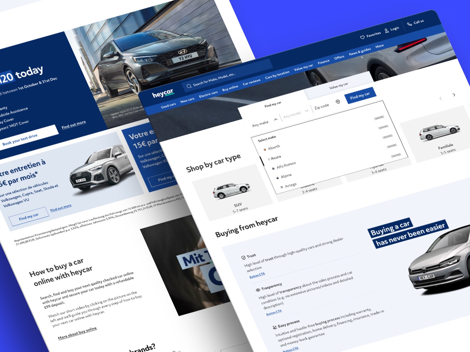
The new search bar shipped as a shared component: a three-field entry point that flexes to each market's postal code format and vehicle data.
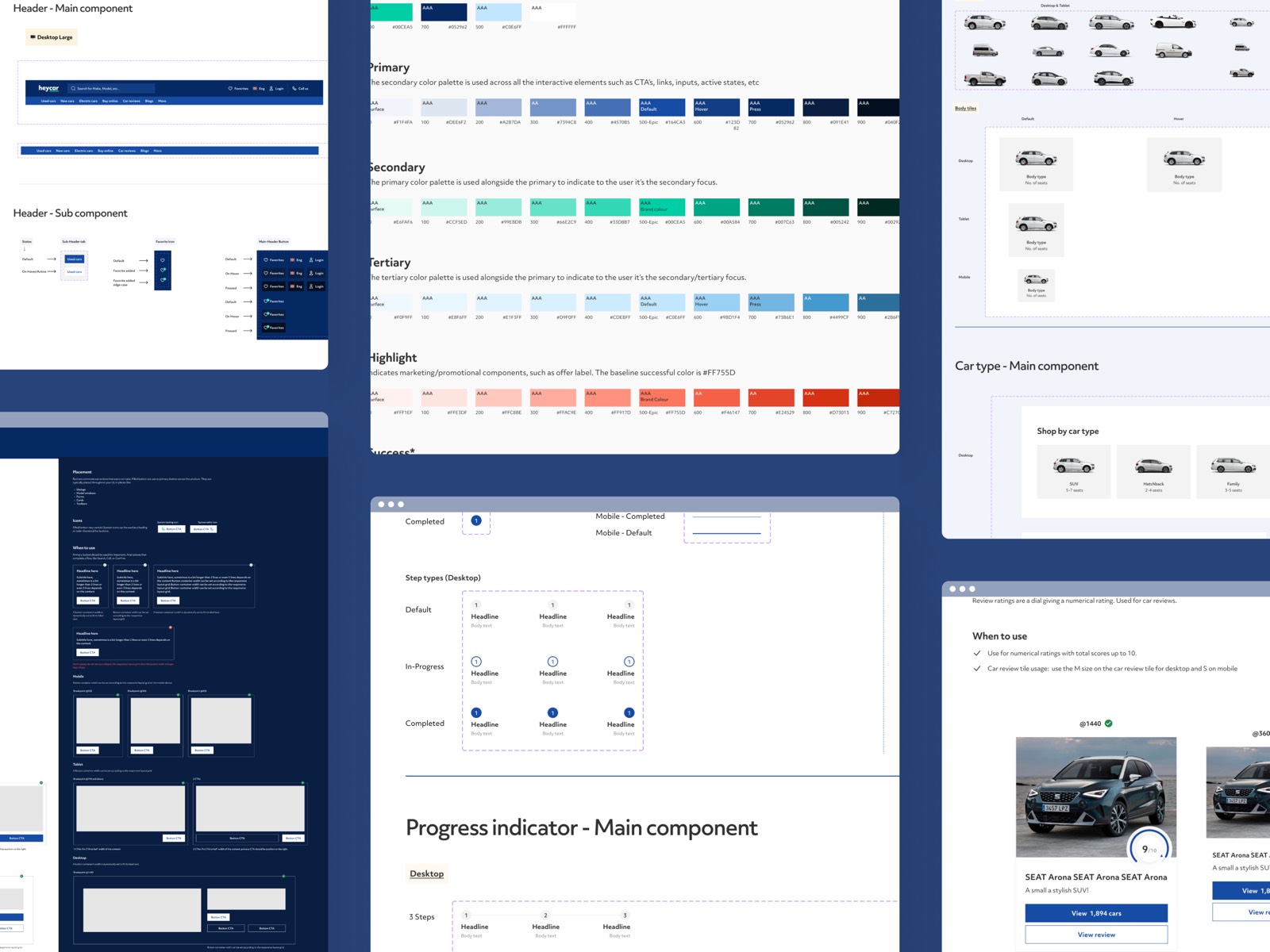
I worked alongside two other designers contributing to the centralised design system, defining tokens, states, and accessibility behavior for the search and filter components, which were then built by the dedicated design system engineering team. The filter components made for the results page were soon picked up by other surfaces across the product. A change made for the homepage became a small but durable shift in how heycar expressed itself everywhere.
Outcomes
- Homepage and search box engagement rose 18% after the three-field search launched, and abandonment at the search step dropped across all four markets.
- Still live across all four markets three years later, having outlasted multiple product cycles and organisational changes.
- A unified search pattern replaced fragmented per-country implementations across Germany, the UK, France, and the Netherlands.
- New reusable components joined the centralised design system and were adopted by teams beyond the homepage.
- Stakeholder thinking shifted from "more filters equals more value" to "depth belongs where it's useful."
What I took from it
Progressive disclosure isn't really a UX pattern. It's a sequencing decision. The real question isn't "what should we show?" It's "when does this become useful?"
Clarity beats comprehensiveness at the entry point. Every input on a starting screen is a tax on momentum. Power users will find depth. First-time users won't push through complexity to find clarity.
And stakeholder alignment is part of the craft. The hardest part of this project wasn't the three-field design. It was building the case that simplification was strategic, not reductive.
Simplifying a flow takes more discipline than expanding one. It's easier to add a filter than to defend the version without it. But figuring out what belongs at each stage of a journey, and being willing to move things rather than just add them, is where design starts to earn its place in product strategy.
The work is still live today. That, more than any metric, tells me the call was the right one.
Let's talk
I'm looking for my next full-time product design role. Tell me about the team and the problems you're working on.